One of the best recognized logos and slogans. Go here to see quick review of the Nike Brand
Chapter Twenty Two
Perceptual — Cues
Perception establishes the opinion about a product or brand when a consumer makes initial contact. In marketing, this is described as consumer information processing. At this early stage, all the senses are engaged in receiving brand marketing communicative messages. In marketing literature, four distinct stages of perception occur during consumer information processing: sensation, attention, interpretation, and retention.
“A physical feeling or
sensation describes what occurs when a person's senses are initially exposed to the external stimulus of a product or brand marketing. The sensory receptors of a consumer are engaged by product or brand cues through sight, sound, smell, taste, and texture.
Attention occurs when a person lingers and gives mental processing capacity to the external stimulus from a product or brand. Selective perception is when a consumer pays attention to messages that are consistent with his or her attitudes, beliefs and needs.
Interpretation occurs when a person assigns a meaning to the sensory stimulus from a product or brand marketing. Comprehension is aided by expectations and familiarity. A consumer scans his memory to retrieve previous experiences with the brand or a similar brand. Store-brand marketing frequently capitalizes on the interpretation stage when product packaging design contains logos, colors and other elements that are similar to national brands that consumers are generally more familiar with.
The retention stage is evident by the storage of product or brand information in short-term and long-term memory.” reference Chron.com
Our visual world encompasses a rich combination of cues: size, shape, color, lightness, motion, depth and others. A Brand's use of color has strong perceptual cues, as people associate a great deal with different colors. Color theory is one of the most powerful tools a Designer can employ. Color instantly sets a mood or conveys an emotion or inspires people to take action.
There are a few rules about color that need to be considered. The best use of color, if at all possible, is to own a color. Few brands own a color as it is pretty difficult to accomplish but owning a color is extremely powerful. Tiffany's owns the light blue that is globally known on their blue jewelry boxes. This is such an essential cue that even the empty Tiffany boxes are sold on eBay. People reuse the box and put another product, maybe not a Tiffany piece, into the box. To demonstrate just how strong the perception is, those who receive a gift in a Tiffany's box think the product inside the box is of higher quality. Tiffany's light blue box is an extremely valuable brand image for its high-quality. Many times with jewelry, unless you are an expert, it can be hard to judge quality so people will use this light blue box as a cue for high-quality products. Mary Kay owns the pink color used in their products. The cosmetics industry is naturally geared towards women. Mary Kay gives away pink Cadillacs to their salespeople and uses the bright pink to symbolize her business. It has also been a strong cue.
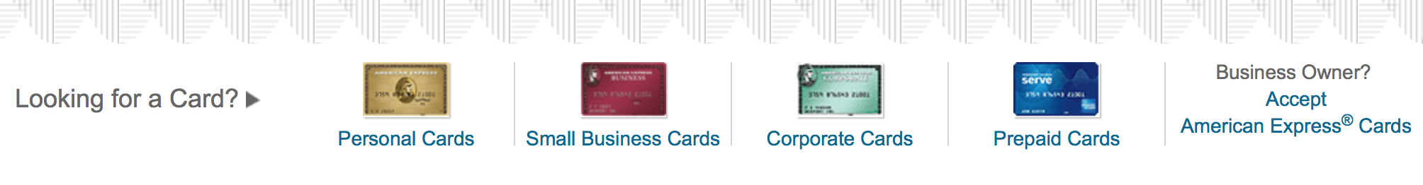
Color can also be used within a brand to separate product lines. American Express has different colored cards including the green card, black card, and silver card; all different colors. You infer different qualities to the card as a function of its color. You need to be careful with the use of color because color can be experienced differently across different platforms. So a lot of times if you're going to test a color you want to test it on a computer, on a phone, and in physicality, to see if the colors vary a little bit. When you want a color to really be identifiable with a particular brand, you want to make sure you have that consistent color across media platforms.
Colors can create strong perceptions. For example, if you look at a product line and you see some of the products are gold, silver, black, or white, it suggests luxury. You assume that the product is more expensive than if it were a primary color. Colors can signal high quality just because it is gold or silver. When you see something that is blue or pink, and you think of male or female. You can have the exact same product but the color changes based on the target gender.
In choosing a color, we know that there are two primary axes of color.
The arousal axis describes how stimulating versus how calming it may be. The affect axis, which means how much people like it or don't like it. The affect axis is extremely important, but it does vary a little bit by cultures. Some colors are better liked in some cultures than other cultures.
High arousal colors such as red and orange create tension and excitement. The opposite can be said of blue and green as they are known universally as calming and soothing colors. Blues and greens also tend to be more popular colors in the US whereas oranges and yellows are typically less popular. This may be different in other cultures. Orange is a very popular color in India. There are also other rules about color coming from extensive research. We know that people automatically react to color. Red, for example, is an exciting and an attention grabber. It's part of the reason why fire engines are red and sometimes yellow. Both colors are attention-getting. Red is also associated with love, romance, and passion.
Red also stimulates the appetite. You will notice a lot of food logos like McDonald's, Pizza Hut, KFC, Wendy’s and Chipotle all stimulate appetite, and they all have a lot of red in their logo. On the other hand, blue is a calming color and it is not a good color for food products. Blue is a color that curbs appetite, and some people have said that if you're on a diet and are trying to eat smaller portions, blue plates can aid in that process. Blue is also a color that is frequently preferred by men. Green is a color that's tranquil. It means health. It can also mean money or nature. A lot of environmental companies use the color green to give you that green notion. Green also means fertility. In recent M&M's ads, you have seen Miss Green, she portrays a sexy, desirable M&M character. Brown is reliable, a little bit boring, but represents a solid earth color.
White is an interesting color because white can mean purity or innocence. People play around with white space, also known as negative space. It can be high design if there is a lot of white space. Black can symbolize evil, or mourning. primary. Some people wear black because they think it creates the perception that they are thin. Yellow is a very bright color that creates a lot of energy. Orange is exciting, warm, and it is an enthusiastic color. Lavender is calming and relaxing. Purple is associated with royalty, wealth, and wisdom. Pink is traditionally a feminine color and is warm and calming.
Actively look for the use of colors and notice which companies use which colors. Bright yellow is used by Nike, Shell Oil, Best Buy, McDonald's, and DHL to attract attention. The friendly fun orange color is used on Hooters, Nickelodeon and, Firefox. Red colors are used by food companies like Kellogg and Coca Cola. Red is also used as an attention-grabber by CNN, Netflix, and Virgin. Purple is a creative color and has been adopted by Yahoo, Barbie, Hallmark and Taco Bell. Blue is a color that generates trust. Many solid companies use blue including Oral B, Walmart, IBM, Pfizer, American Express, and GE. Green is more of a natural color. Whole Foods and Starbucks embrace green. Some oil companies like BP have used green to indicate that they have environmental leanings.
Grey, black and white colors are thought of as balance colors. Look at the logos and start thinking about how the colors are working. The New York Times employs a black logo. Apple at times uses a silver apple. Mercedes Benz utilizes a silver tint. In these examples, these colors provide more balance.
Let's look at symbols. Symbols can add a lot of fun, and a lot of attention to a brand. Mickey Mouse is a very famous symbol. Mr. Clean is a product used for cleaning. Mr. Clean, the symbol is a strong muscular man that communicates certain types of associations. Because of the strong muscular man symbol, it is presumed that the Mr. Clean product has strength. The Wells Fargo symbol also has many associations including independence and wild west adventures. Charlie the Tuna invokes positive feelings as does the Pillsbury Dough Boy. Remember symbols can become outdated and tied into a particular era; use careful consideration when working with them. Symbols can also be repositioned and redesigned. Slogans can be tailored to help the positioning strategy by communicating the brand mantra.
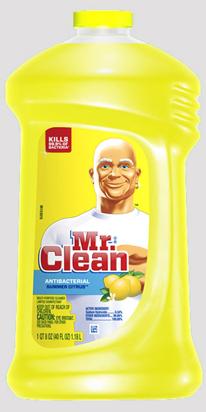
 The crowded household cleaning products category had become homogenized, with one product demonstration blending into the next. Product messages had become ineffective. However, on Mr. Clean’s Facebook page, there was a surprising affection as fans had started personifying him, talking about Mr. Clean as a guy. So the page adopted his voice, and quickly grew to 500,000 fans with one of the highest engagement ratios of all P&G brands on Facebook, giving it a cultural relevance Mr. Clean hadn’t seen in over a decade. Mr. Clean was relaunched in mass media with the story of how he came to be the king of clean in an 80-second spot running in cinemas and online, with a 60-second version on TV.
 Learn how Mr Clean fared in his return: Strategy - Mr Clean
Sometimes, if you just have certain brand elements, you may want a slogan or a tagline that can help remove some of the ambiguity that is associated with the brand or the logo. It is the tagline that can create its own kind of warmth and emotion, like “reach out and touch someone”. The brand or the tagline can also reinforce the name or the symbol. Because the consumer will see it multiple times, the tagline should be short and powerful enough to communicate a strong message. Airbnb - “Welcome Home.”
Taglines must be differentiated, if they sound the same as another, they might be confused with the competition. Similarly, it should be unique, easy to say and easy to remember. You want to avoid any negative interpretations, so you have to market test it, particularly when you go across cultures. A really great tagline like “Just Do It” ought to be trademarked so that it is protected. A tagline that evokes emotion will make the product that much stronger.
There are different types of taglines such as Imperative; “Think, Invent!” Descriptive, which adds more information. “Moving at the Speed of Business,” “Bullish on America,” “You're in Good Hands,” They can also be Superlative; “The Ultimate Driving Machine”, “There's no Better Way to Fly” and “Shave Time.Shave Money”. They can be Provocative and Clever like “Got Milk?” another clever one is what VW (Volkswagen) has done with their slogan, “Drivers Wanted.”
The power of a brand logo and slogan is evident in the banner at the top of this page. Everyone knows the name of the company represented, the product and what to expect from the product. Wearing clothing with the swoosh emblazoned upon it empowers the wearer with the power to “just do it!”
To view a wonderful collection showing the use of brand elements visit the Branding Pinterest page.