According to Marty Neumeier in his book The Brand Gap, “A retail package is the last and best chance to make a sale.” Given that not all brands are products and not all products go retail, the truth is that product and package design are vital when it comes to brand image. More than half of purchases are based on emotions, especially when a client is unsure and must choose between two brands of products. It’s no surprise that companies that master the art of aesthetics are on the top of their game-Apple, Bang & Olufsen, Nike, IKEA, Nokia, or Cassina.
Packaging should be clever and intentional. If we’re not deliberately trying to create a connection with our customers in everything we do then what’s the point? Wrappers are the opening line of the brand story.
The ‘once upon a time.’ The first thing the customer notices, touches and experiences.
The story we give her to tell, (often to herself).
The inconspicuous red sole of a Christian Louboutin shoe. The encouraging manifesto on a Lululemon bag. The highly researched and purposefully created unboxing experience of an Apple product. And yes, the gorgeous paper on a Mast Brothers chocolate bar—all clever packaging that customers are happy to pay for because of how it makes them feel.
What exactly happens when we find ourselves in front of an aisle with tens of hundreds of products just staring back at us? We start to compare, remember and associate. The brain is prone to classifying everything around us, it’s the only way we can organize everything we see, hear, feel or know. If we didn’t, we would all go bananas. Filling that slot or opening in that mental category is crucial, it is what is referred to as the ‘Top of Mind.’
Whether we associate the product with its ad, with a friend who we know that uses it, or with the packaging’s color and layout and what those elements mean in our mind, elegant, simple, tacky, appropriate, product design involves form and function and for many, implies the beginning of the brand experience with the client. In some cases, it triggers the basis for customer loyalty. Even shopping bags speak to our clients and influence brand perception.
Even though we are not aware of it, our senses provide a significant amount of information in our day-to-day life. Research shows that consumers have a more favorable approach to brands that reach us through all senses.
Design is an essential part of a brand’s approach in that it reaches people through the sense of sight and tact. Imagine pairing that up with marketing tools that target the other senses of sound, smell, and taste. You’d be sitting in a winning lottery ticket.
From a product’s first prototype to its final version up on a shelf, product, and packaging design reflect a specialty in itself and involves collaboration with industrial designers, manufacturers and packaging engineers. A unified and coherent approach from all levels leads to a powerful brand presence.
Packaging has a substantial effect on perceptions. The packaging we are familiar with today began in the 1930s. The grocery store experience changed from acquiring meats and other food items directly from the grocer or butcher behind the counter to the self-service supermarkets. At the supermarket, the consumers went up and down the aisles selecting products without any assistance. When this began, it was evident that the packaging of the product would matter a great deal. It also prompted the question; how will people use packaging cues to make choices in a supermarket?
Functions of Product and Package Design
Constitutes the physical representation of a brand's personality.
Draws attention to a specific product in a crowded retail space. (in this case, a product’s packaging serves as a great promotional tool)
Positions a product amongst a particular category and perceived value, hence reflecting a specific possible price.
Serves as a protective container, as well as provides useful nutritional information or instructions of use.
The package is an essential brand identity tool. Even a specific color might trigger an association to a particular brand.
Differentiates a product from its competitors and private labels by transmitting a sense of worth or a story.
Packages might also serve as souvenirs, collectibles or a source of storage.
When a product design is groundbreaking, it can influence the way we use something specific by shifting behavior patterns.
Reflects the level of modernism, creativity and cutting-edge qualities the brand might have.
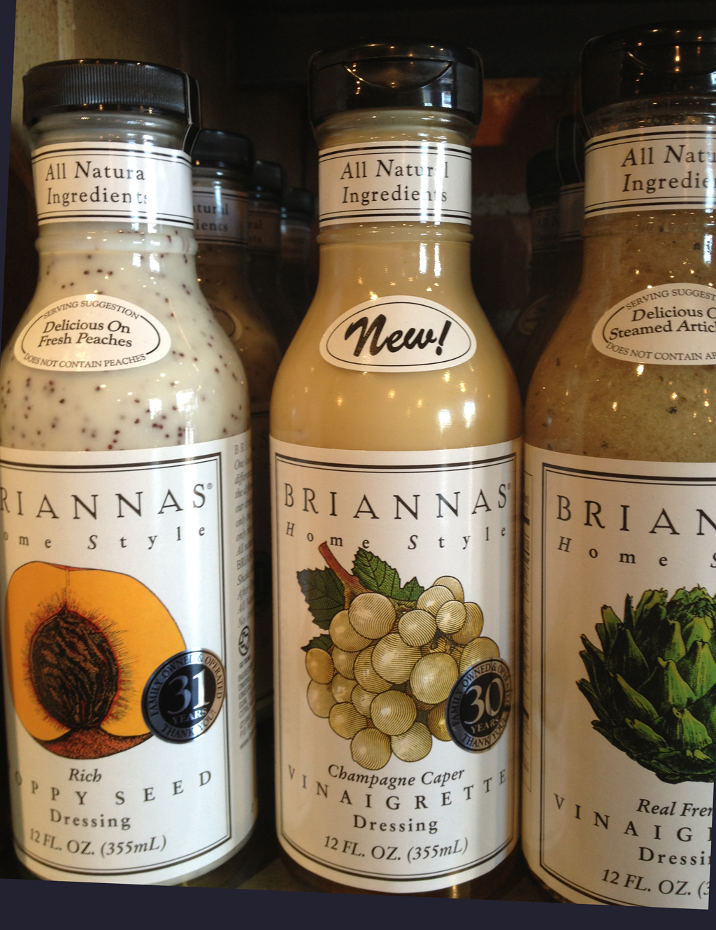
Example of packaging used for on the shelving display
Box folding top flap Inside box folding top flap
Today, design can be synonymous to style, usability and that personal stamp that defines a product. And not to mention a brand. With all the competition in the marketplace, physical differentiation is crucial if you want to stand out. It provides that added-value that customers cherish so much and enjoy, which in turn serves as a slingshot for you, your product's increase in desirability and perceived value can help you charge more for it. A definite win-win situation.
One of the earliest packaging experiments tested was with Tide detergent. Detergent was packaged in two different boxes. On one package, there was a design with circles, and on the other package was designed using triangles. The experiment was to see which package the consumer would choose. People preferred the detergent that was in the box with circles.
In the next experiment, they invited the consumer to take both of the detergents home. The soap in each box were the same, the only difference was the packaging. After using the detergent from both boxes, the consumer was asked, which detergent did you like better? The consumer preferred the detergent with the circles on the package. They also believed that the detergent in the box with the circles worked better. It was astonishing at the time because the consumer couldn't believe it was the exact same detergent. They redid the study a few times with larger sample sizes and consistently got the same result. That was the beginning of understanding that package design absolutely influences the perception of the product. Today, Tide still has circles on its product. Even when it goes into different countries, the packaging will change but the circles will remain. The bright yellow rings pop out at you.
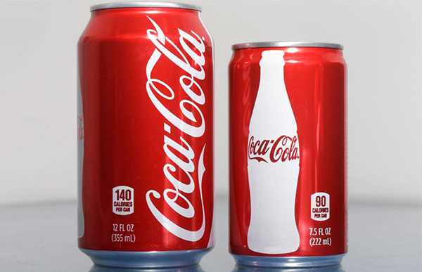
Packaging is interesting due to its influence on the consumer at the point of purchase. It not only gives you a reason to choose when you're purchasing, but it also influences your perception of the product experience. But as these experiments show, it continues to have an influence at the point of consumption. There are many objectives in a package design. You can identify the product, you can present information, the container can be used to protect and store the product. It can aid in consumption, and provide information on how to use the product appropriately. The package can use perceptual cues to aid the consumer to identify and make judgments about the product. Coke has come under scrutiny for its sugar content. Their smaller 7.5 fl oz package gives the impression in the consumer's mind that they are cutting back on sugar consumption.
The smaller container is more profitable per ounce of fluid and is still the same great Coke taste!
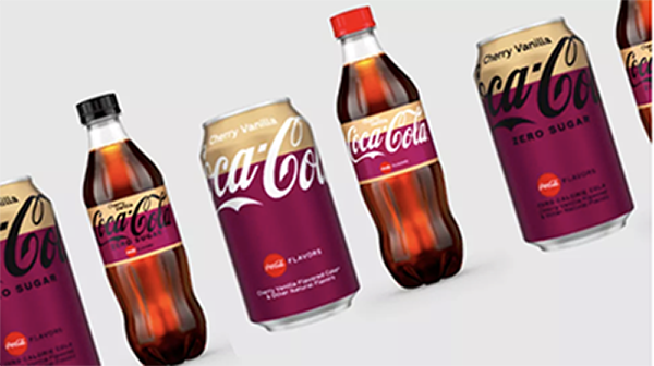
The company has revealed brand new packaging across the entire range of Coca-Cola drinks, along with a brand new flavor, Mocha. Coke, says the redesign is designed to make the flavors easier to differentiate!
Packaging aesthetics and function are critical. The colors are used to help grab consumers' attention in a sea of competing messages. You want to choose variations of color and design to make an impactful package, so the consumer buys the product over and over again.
You have to know your distribution channels because you don't necessarily control the way the package is ultimately displayed. You might do some interesting things with your package, and then the retailer doesn't necessarily abide by the way the package should be displayed. Lets go over some iconic packages and how they've changed customer perceptions and helped build market share.
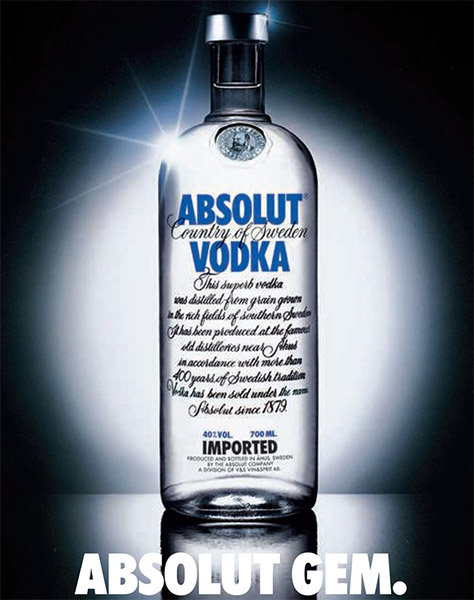
The Absolut Vodka bottle is famous for its shape. The entire print campaign was predicated on the shape of the bottle and was used for about ten years. A lot of times people have difficulty telling different vodkas apart. That's not to say they're not different. Some people have difficulty at times, especially after the tenth drink. The bottle was important. Brand loyalty was established by the brand name and the shape of the vodka bottle. The Absolut bottle is unusual. Most spirit bottles have a longer neck designed to be handled when poured by bartenders. The Absolut bottle isn't easy to use. The shape of the bottle is important and the focus in advertisements. The ads went through different stages. Some of the ads just showed the bottle, some of the ads showed other things in that shape. In a famous Los Angeles ad, they feature a swimming pool in the shape of the Absolut bottle. They have used celebrities and artists in a lot of creative ways, but it was always around the shape of the bottle.
Another iconic shaped bottle is Coca-Cola. Coca-Cola is a very strong brand. Part of that brand imagery comes not only in their logo, their red color, their famous polar bear ads and other types of ads but also in the shape of their six and a half ounce bottle. Their six and a half ounce bottle was their first product. Consumers could tell it was Coca-Cola from all the other soft drinks out there by its distinctive shape. When Coca-Cola came out with their plastic bottle, they lost the unique shape. That was a decided disadvantage. But they managed to figure out how to recreate their iconic glass shape in plastic. Coca-Cola sent out empty plastic bottles of Coca-Cola in their iconic shape to influencers because they were so happy that they had managed to reproduce this in this new material. They understood how important that was.
One of the most successful new products in the soft drink industry was the refrigerator pack. Market research showed that if the cans of soda were in the back of the refrigerator, people did not consume as much. If they wanted people to consume the product, they needed some mechanism to bring the cans to the front of the refrigerator. Refrigerated packages were designed with that in mind. That particular package design single-handedly increased market share for the companies that started using it. It was a very successful new product introduction that didn't have anything to do with the actual product.
Some years ago Calvin Klein came out with a new fragrance that was designed for both men and women. The ads were suggestive as they depicted models whose gender was ambiguous. The packaging of the CK Cologne has a certain edginess to it. The cologne bottle is in the shape of a flask, an exciting concept for cologne as it is not the first thing one thinks about with regard to cologne. CK used symmetry in its logo, which added to this notion of edginess. Many people are not experts in choosing fragrance scents, as a result the packaging and brand name is very influential in what people prefer.
Mintel has announced six critical trends set to impact global packaging markets.
Digital package printing brings personalization to the brand byways of consumer relations, which is one of the critical aspects in reaching out to Millennials.
Package recycling is way below its potential, despite a brand’s best intentions. Eco-friendly or reusable attributes are marked as a crucial purchasing factor.
Wedging too much information on the package or showcasing false attributes can confuse potential customers; therefore Mintel foresees greater utilization of a clean label concept. Looking ahead, the concepts of clean labeling and clear on-pack communication are set to converge.
Mobile-engaged packaging and the importance of integrating modern technology into the brand's image to gain potential shoppers’ trust.
No longer is flexible packaging (particularly pouches) considered a tradeoff. But at what point will it become non-differentiated? Truly innovative brands are looking to the next generation of rigid/flexible hybrids that offer functional and environmental benefits alongside excellant shelf presence.
Brands should leave packaging dimensions open to consumer tastes and offer their products in various sizes.
“Pleasing consumer desires is almost like fighting a hydra, especially when it comes to package design where standards are always shifting to match market demand. Therefore, brands are constantly striving to bring innovation and additional leverage to their packaging.”
reference Mintel — the world's leading market intelligence agency
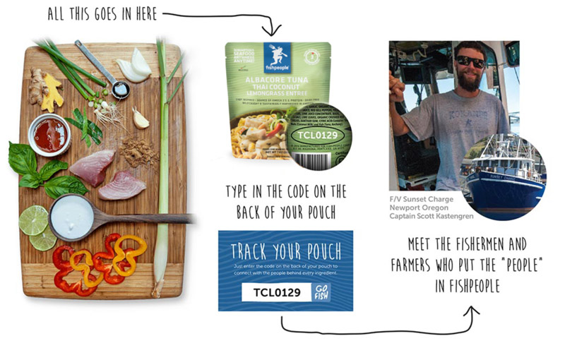
FISHPEOPLE, WE LOVE OUR SEAFOOD & THE SEA IT COMES FROM
Image from the Fish People website
That means combining wild fish, sustainably caught, with West Coast harvested ingredients to create convenient gourmet seafood meals that you can eat anywhere, anytime. And to make sure their customers know who caught the fish they just purchased they provide a code on the package. Entering the code on the Fish People website connects with the people behind every ingredient.
 Packaging should be clever and intentional. If we’re not deliberately trying to create a connection with our customers in everything we do then what’s the point? Wrappers are the opening line of the brand story.
The ‘once upon a time.’ The first thing the customer notices, touches and experiences.
The story we give her to tell, (often to herself).
The inconspicuous red sole of a Christian Louboutin shoe. The encouraging manifesto on a Lululemon bag. The highly researched and purposefully created unboxing experience of an Apple product. And yes, the gorgeous paper on a Mast Brothers chocolate bar—all clever packaging that customers are happy to pay for because of how it makes them feel.
Packaging should be clever and intentional. If we’re not deliberately trying to create a connection with our customers in everything we do then what’s the point? Wrappers are the opening line of the brand story.
The ‘once upon a time.’ The first thing the customer notices, touches and experiences.
The story we give her to tell, (often to herself).
The inconspicuous red sole of a Christian Louboutin shoe. The encouraging manifesto on a Lululemon bag. The highly researched and purposefully created unboxing experience of an Apple product. And yes, the gorgeous paper on a Mast Brothers chocolate bar—all clever packaging that customers are happy to pay for because of how it makes them feel.