For a brand to remain current, it has to evolve. An essential part of brand management is brand repositioning. The brand may need to be refreshed as the customer base changes over time from the initial position. How is a brand repositioned? The brand's equity must be actively managed from the very beginning. Ideally, the best way to keep a brand fresh is with constant evaluation. Waiting until a brand is out-of-date makes it much harder to re-position the brand. Brand meanings must be reinforced but sometimes require a small adjustment. New sources and new ways of identifying equity are needed.
“The coffee is top-quality, but Kohana wasn’t communicating with consumers. Our work began with a review of their positioning and an analysis of the brand’s existing assets.” From Helms Workshop, an independent, strategic brand design studio commissioned to work with Kohana Coffee to redesign their brand.
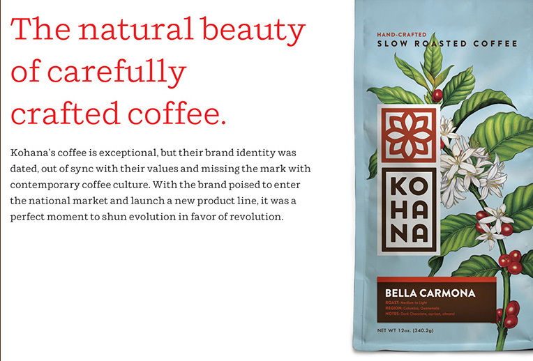 image from the Helms Workshop website.
image from the Helms Workshop website.
Steps taken: “Kohana” is the small, white Hawaiian flower that heralds the arrival of the coffee cherry. It signals the promise of coffee to come and the beginning of an extraordinary experience. It’s a potent symbol for the brand, but it wasn’t being leveraged in a way that resonated with consumers.
KO HA NA
By clustering the Kohana name into three distinctive verbal cues, it allows for quick unpacking of the word, and an immediate understanding of pronunciation.
Equally important, this treatment engages consumers in a moment of actual interaction with the name, which reinforces recognition.
Our solution was to let the flower speak for itself. Rather than just telling consumers that the coffee is organic and natural, we would show them— allowing the inherent beauty of the coffee plant tell the story in an honest, pure way. Critical drivers for new brand packaging. We united the previously fragmented Kohana system under a consistent color palette and messaging platform and extended the language across the full spectrum of brand packaging to reinforce recognition in different parts of the store. The identity system is designed to reach across a broad range of applications, bringing the brand to life in unique ways in a variety of settings. In the words of Kohana's founder, “The work was fresh, appealing, true to our roots, distinctive and differentiated.” Visit the KOHANA website, and you will notice the consistent color, font styles, images, logos and message from the Website to packaging, and coffee cup.
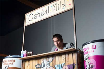
COW WOW CEREAL MILK is a two-year-old company that makes milk in breakfast cereal flavors. With a child-friendly cow on the front of the package and giving his flavors names like Fruity Trudy and Chocolate Chip Cathy, COW WOW has branded their product for 5 to 12 year-olds.
One reason for brand repositioning is that the initial positioning was not appropriate. For instance, Cow Wow Milk was initially targeted to children, but after several years they discovered their true customers were high school and college students.
Sometimes sales are just not what was anticipated, and one reason for this is the brand was poorly conceived. The next course of action requires that the brand is re-positioned.
Sometimes perfect positioning for a particular target audience is in place, but the audience is not profitable. From the beginning, it may have seemed like a really good idea for an excellant customer segment, but did not end up reaching the projected results. This may require re-positioning the brand. If the brand becomes outdated or if the marketing approach becomes obsolete, a repositioning is required to get the brand back on trend.
Brand positioning at Coca Cola

“When we (Turner Duckworth) started working with Coca-Cola in 2006, the once iconic brand had become a victim of its own success. People were so familiar with Coke that they were no longer noticing it, and the design leadership that the brand had shown in the past was nowhere to be found. To begin with, we looked at every product within the brand. Brand guidelines describe how a brand should look, but reality usually tells a different story. Much of the output was promotional materials that were cluttered and communicated nothing significant about the brand. Even the core identity had become unnecessarily complex and laden with clichéd elements. The brand was everywhere, but easy to ignore. The team at Coca-Cola had recently re-discovered a clear and simple purpose for the brand: ‘Coke brings joy.’ Coke’s visual identity needed to communicate that truth wherever it appeared, and inspire people to reconsider the brand.”
“We (Turner Duckworth) built a clear strategic rationale for simplification, supported by best in class examples from other categories. But simplicity alone is not the answer. These days, brands must constantly adapt to changing contexts, and for a brand like Coca-Cola with a single product that never changes—a living, breathing visual identity is all the more important. Everything created in a brand’s name communicates something about the brand’s values and purpose. At times, even the humblest little object like a paper cup can be more iconic than a splashy advertising campaign.” Turner Duckworth is an international design company and was commissioned by The Coca Cola Company to refresh the Coca Cola brand.
“During a presentation in November 2014, Coke's North American president Sandy Douglas said the health and wellness trend has set up ‘a tremendous opportunity for the Coca-Cola brand with our smaller packages.’
He noted a regular 12-ounce can of Coke on average sells for 31 cents. By comparison, a 7.5-ounce mini-can sells for 40 cents. That translates to 2.6 cents-per-ounce for a regular can, versus 5.3 cents-per-ounce for the mini version.”
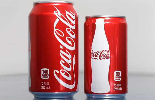
“Coca-Cola said that while it may be selling less soda, smaller packs are pushing up revenue. Sales of Coke's smaller sizes — which include a 1.25-liter bottle as an alternative to the 2-liter bottle — were up 9 percent last year through October, according to the presentation by Douglas. By comparison, sales of its 12-ounce cans and 2-liter bottles edged up 0.1 percent.
That doesn't mean Coke and Pepsi are abandoning their more generous servings of which still dominate the industry. It's not clear how big the appetite for the newer cans and bottles can grow over time. In 2013, mini-cans accounted for 1.1 percent of sales volume in supermarkets, according to Beverage Digest. But they accounted for 2.4 percent of sales dollars, more than double their volume share.”
“Bonnie Herzog, a Wells Fargo beverage industry analyst, said the smaller options are part of how Coke is repositioning itself amid changing habits around soda. She noted the company is also pushing Coke Life, a reduced-calorie drink sweetened with a mix of sugar and stevia.
‘It's responsible, and it's realistic,’ Herzog said, noting the smaller sizes are marketed as 'moments of pleasure' people don't have to give up.” retrieved from Chicago Tribune
Sometimes the brand strategy loses its edge. At one point it was current and fresh but over time, people desire something new and innovative. It isn't that the brand strategy was wrong or that the target segment had a change in preferences, but the product simply became dated. Something needs to change to spruce it up if not, it became stagnant. In the case of some automobile brands, as their customers aged, the brand did too. When some folks shop for a new vehicle because they want to feel young, they will turn in their Lincoln and buy a Mustang. Others shop because they want something different, something new. These are some of the reasons that create the need for a brand change. Consistency is the most important factor when re-positioning a brand.
Oldsmobile was a classic American car built by GM, and it embodies traditional American values and a story that resonated well with its audience; the proud American consumer. During its heyday, this classic GM brand was one of the most innovative cars on the market as it pushed the boundaries of technology and design. The advertising cleverly and effectively communicated, “Escape from the ordinary.” During the late eighties to mid-nineties, the Oldsmobile brand began to lose its identity. Faced with tough competition from Asian rivals, it went about re-inventing itself to appeal to a younger audience. What Oldsmobile didn’t count on was the power of story. It did not consider the negative implications associated with telling a different story; one that radically contradicts the essence of the brand and what it stood for. Ultimately, the brand eventually went out of production.
- Read more at Brand Stories
For the most part, when brands re-position, they must maintain a position consistent with the old position. At the very least, the new position must be at least similar enough to the old positioning so that consumers believe it. For example, if your product was considered a luxury brand, it will be hard to convince the market that it is now a low-cost alternative in the segment. When it is radically different, people won't necessarily make the connection between the old product and the newly rebranded product. In some instances, it has worked, but for the most part, the best way to re-position a brand is to do something consistent with the brand DNA. Cadillac was, at one point, the definition of luxury in the world. GM underinvested in the brand and underinvested in the product and destroyed the brand. People don’t look at Cadillac now and say, “ 'Oh, that’s the definition of luxury.' And we need to re-establish that reputation.” General Motors CFO Chuck Stevens
People frequently interpret a message or the data, consistent with what they already believe. This is a well-known method of rationalizing behavior. Recognize when repositioning a brand, the message to consumers must be consistent with their existing perception. If not, they will reject it and will look for ways to rationalize the message, so it makes sense to them. The key to success is to maintain consistency in the message or else change whichever message is weakest so that it is consistent. Oldsmobile was known as a car that was always associated with dad or father. The assumption is young people do not like “old people cars.” The notion that Oldsmobile was associated with their father was a turnoff to some younger people.
Oldsmobile understood that and came out with a new ad which signified new excitement by essentially saying we're not a fuddy-duddy car. We are an exciting car as this is the car for young people. By doing this, they created cognitive dissonance as the association with dad and Oldsmobile was extremely strong. In addition, the association that dad is not exciting was extremely strong. The weak link here was that Oldsmobile cannot be an exciting car. That proved to be a very strong inconsistency they could not fight. Oldsmobile was just so strongly associated with not–so–exciting fathers that people just did not believe the new ad. In fact, their slogan at the time was, “This is not your Father's Oldsmobile”. Anybody knows as soon as I say, this is not my father's Oldsmobile, it is simply reinforcing that it is exactly my father's Oldsmobile. Consider the brand name itself, it is literally called an old mobile. By the time GM opted to make a change, it was impossible to do so and they eventually had to take the product off the market.
Ideally, the brand name can change slowly to reflect the evolving identity such as when American Online turned into AOL. Different slogans can also be used. To reposition the brand, subtle tweaks may be necessary to keep it modern. Tweaking elements of the brand may be in order if the brand will be stretched into new products. The brand meaning may need to be expanded so that it is flexible and adaptable to fit the new product.
There are two ways to implement a change. One way is called the just noticeable difference. Very subtle little changes are made from point to point and they are barely noticed. This subtle change occurs yearly. After 20 years, it is very hard to discern the difference from the first change to the last change. Some brands make tiny little tweaks in their packaging and as time passes, people still believe it is the same product. Compare closely one version to another version and, 65 years later there is clearly a radical difference yet the brand remains modern. Many consumer packaged goods use this kind of just noticeable difference positioning.
Another way to make a change is to use the butterfly effect. Here the implication is that change is done in one big leap. The change is markedly different in an effort to keep the brand modern and new. This type of change is essential for some categories including cosmetics and clothing. Brands that stay exciting and fresh provide an even stronger incentive for consumers to purchase from them.
Making the brand a little more exciting and modern is one change that can advance a brand. In recent years, Lululemon's sales fell due to their competition surpassing them by using patterns that were slightly more modern. Initially, Lululemon hesitantly moved to a more modern look with their sportswear that worked well within the believability of their upscale brand. They used the butterfly effect to produce a change that the customer noticed but continued to believe was the same upscale product.
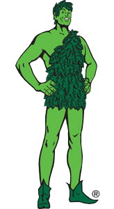
Trademarks also evolve as the Jolly Green Giant was adjusted several times in his early life. See this story from AdAge.The once Giant figure became dated. General Mills updated him to a Jolly Green Giant figure that is physically fit, athletic and more modern.
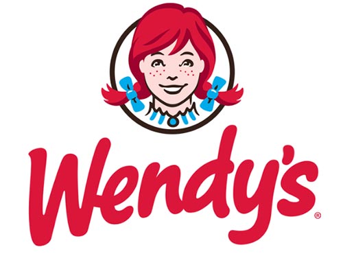
A transformation occurred recently at Wendy's, the hamburger chain. They decided to remove “Old Fashioned Hamburgers” from their slogan and signage. They also changed the old fashioned typeface to a more modern typeface. Wendy's expanded its menu options to include a variety of choices in addition to the hamburger. Market research discovered that people identified and liked the Wendy character, founder Dave Thomas' daughter for whom the business was named. The Wendy character also changed into one that appears more modern and more expansive as lots of things are possible at Wendy's. Even with these subtle changes, it's still very much identified as a Wendy's. The brand was updated to reflect a current trend yet it is connected enough that people continue to recognize it as Wendy's. “Wendy's brand transformation is re-energizing all of our touch points with consumers. From bold restaurant design to innovative food that consumers' want, to improved customer service, this exciting evolution of our brand reinforces our mission to position Wendy's as ‘A Cut Above.’ ” – Emil Brolick, The Wendy's Company President & CEO
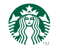
Starbucks changed its signage from Starbucks Coffee to just the image of the mermaid. Despite the change, people still know that it is Starbucks by that image.
One brand that has successfully kept themselves modern is BMW. BMW could have easily been in a similar situation as Oldsmobile because it was a product that your father drove. BMW had a lot of associations including a German car, an expensive car and a car driven by baby boomers. At one time, all of this was good. In fact, BMW's were called “Beemers” as they were thought of as a car driven by the baby boomers. With time, the associations get old. Although these associations started out as positive, if they're not carefully cultivated, they could turn negative. For instance, the once coveted design with its expensive price tag could be viewed as impractical. The aging baby boomers can come across as stuffy. Finally, BMW, the German brand could be perceived as aloof. How did BMW cultivate the positive associations? They did it through the strategic use of sponsorships including sponsoring high-performance bikes and golf tournaments. BMW also changed the design of its cars. They were also very careful with their advertising. BMW represented performance which epitomizes modern. They associated their brand name with the young and powerful. BMW used good imagery. They even sold BMW sunglasses. Their associations remained current and positive overall.
“When Lincoln's marketing team first started talking about how to market the new MKC model, a celebrity spokesperson wasn’t even part of the discussion. It was a pivotal moment for the brand—the MKC was pegged as a cornerstone of Lincoln's revival, and the car was earning positive reviews. The ads were a hit, blazing across the Internet and earning spoofs from Jim Carrey and Ellen DeGeneres. Suddenly, the brand was reaping the kind of cultural awareness that marketers contort themselves in all sorts of unbecoming ways to reach for but ralely grasp. The campaign, and its attendant SNL and Twitter buzz, helped Lincoln boost sales—which hit a 32-year sales low in 2013—by 16% in 2014. Lincoln’s global director Matt VanDyke says the McConaughey campaign drove traffic to dealers, tripled its website traffic, and helped the brand hit about 10% market share in the fourth quarter of 2014, which is about double its brand average.” Jeff Beer, fastcocreate.com
Budweiser is another company that remained very young with their sponsorships and clever advertising. Easily Budweiser Beer could very well be your father's beer, as it has been around quite a while. Budweiser's continual positioning of their product is a classic example of staying current and modern. Most changes were just barely noticeable implemented very subtly, others were a little bit bigger like a butterfly effect, but all remained within the brand DNA. As a result, people accepted the changes. The significant point here: Consistency over time is extremely valuable in building strong brands. It is imperative that the brand remains modern. Keeping the brand current can be a bit tricky because anything that threatens the consistency chain may result in the loss of credibility. People just won't believe it. The change must be something that is consistent with the brand DNA and is continuously moving it forward. Ideally, all the brand elements must work in harmony to communicate brand identity. Necessary change requires careful consideration because customers may not accept major change and it might just fail. Sustaining a modern brand mandates a comprehensive understanding of the brand mantra, the brand DNA, the brand positioning, and the target segment. We have covered all of these topics in previous chapters. A modern brand also requires considering the following: what is the point of differentiation, what is strong about the brand, what is positive about the brand, and what is unique. When adjustments are made, consistency regarding the brand image is imperative.

In March 2009, the name Airbedandbreakfast.com was shortened to Airbnb.com, and the site's content expanded from air beds and shared spaces to a variety of properties including entire homes and apartments, private rooms, castles, boats, manors, tree houses, tipis, igloos, private islands, and other properties.
“Those who know how to swing from product-benefit-driven marketing platforms to values-driven marketing platforms are the ones that seem to endure and seem to build the most amount of equity into the brand,” says Mildenhall. “People have to understand what the product does for them and how they might feel when they’re using it, but they also have to be inspired by the type of person that that behavior suggests that they are. This piece of work is all about the values and curiosity, and the next generation of explorers who are invited, motivated and excited about going into the world and being curious about other cultures, people and homes.” Airbnb chief marketing officer Jonathan Mildenhall quoted in Fastcocreate
In the fall of 2016, Airbnb announced a new product called Airbnb Trips, a portfolio of offbeat excursions developed by freelance hosts. They have a built-in customer base that purchases millions of trips per year. People on Airbnb want to feel like a local in their stays, and that goes for lodging and experiences. The new Places section of the Airbnb platform encompasses Insider Guidebooks. Use the new Airbnb app to experience and learn from local legends, like surf pros, up-and-coming artists, master chefs, and nonprofit founders.
Successful strategies ensure that companies will eventually outgrow their target customers. Competition, innovation, and demographics ensure the opposite: that target customers will outgrow their strategy. Both scenarios create existential threats. The only way out is to stretch your strategy in ways that will open new markets to conquer when you’ve hit the limits of your original markets, or to breathe new life into your current markets when they are starting to slip from your grasp. Read more on repurposing your brand – Has Your Strategy's Shelf Life Expired.